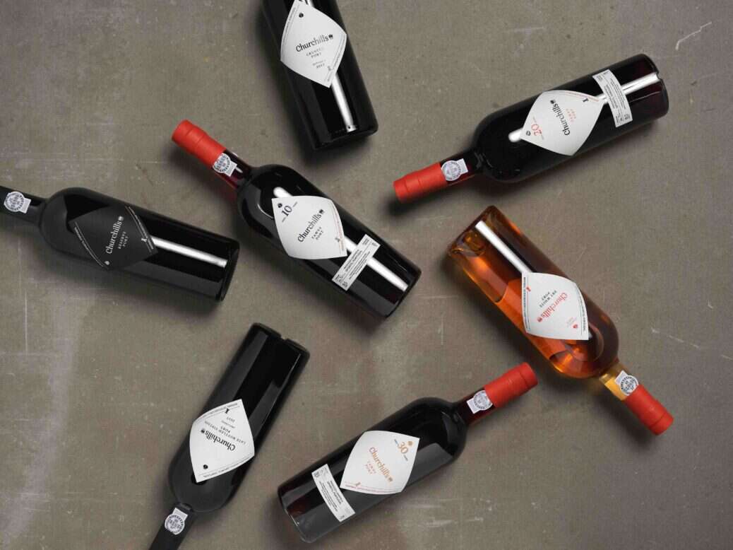
To mark the start of its fifth decade, Churchill’s is launching a new chapter for its portfolio of Port and Douro wines spearheaded by a new generation.
The comprehensive brand reboot emphasizes Churchill’s longstanding leadership in innovation and minimal intervention winemaking, while telling a powerful story about the youngest and last independent British Port house.
“I was just 29 when I founded Churchill’s in 1981, and I had a passion to make something distinct in the world,” said Churchill’s founder and winemaker Johnny Graham. “I took traditional production methods, exclusively top-quality grapes, and I combined that with a willingness to experiment making wines that didn’t always conform to what people were expecting.”
The last four decades saw Johnny build a world-class Port house and winery from scratch and a loyal following of drinkers around the world. No one had started a Port company in more than 50 years, and few have dared since. Johnny was the latest in a family of founders, whose legacy in the Douro stretches back six generations. Now, his daughter Zoe Graham and son-in-law Ben Himowitz are preparing for the next 40 years.
“One of the challenges we face as a category is how to re-introduce Port to a new generation of drinkers”, said Zoe Graham. “Our belief is that we need to go beyond the cocktail mixing directed at this target to make Port a desirable icon of luxury and beauty as this generation defines it.”
“Nothing exists in isolation for people today and we wanted to identify a clear place for Port within a contemporary human’s lifestyle and drinking repertoire. We were looking for a visual identity and aesthetic for our Ports and Douro wines that thought outside the box in terms of the usual category conventions.”
Beautiful minimalism
All Churchill’s Port grapes are hand-picked and foot-crushed in the ancient treading tanks in their winery at Quinta da Gricha and are distinct for their elegance and freshness. “Two words at the heart of our brand refresh were beauty and minimalism,” said Zoe Graham. “We wanted to make the image of our Ports match the truth of the wine, as well as Churchill’s philosophy of minimal intervention craft.”
The resulting design of the new Churchill’s brand sees subtle but bold transformations, from the diamond label and lower-case wordmark to a move away from the conventional brand crest in favor of hallmarks that tell the story of the family and its wines. While maintaining the crown, to represent Churchill’s origin story and its founder’s maverick spirit, the new disassembled crest also includes a rook and a shell. The rook is drawn from the granite lagares at Quinta da Gricha and represents Churchill’s minimal intervention winemaking philosophy. The shell comes from the Graham family heraldry and represents home, as the original symbol used by the family company when they first settled in Portugal in 1808. The next generation wanted to bring back this symbol of nature to stand for their commitment to a sustainable future legacy.

Along with their Ports, Churchill’s launches a refreshed image for its Churchill’s Estates range of Douro wines. The new name—GRAFITE—and hand-drawn labels celebrate the iconic Douro terroir. The name came from the tasting room, as it is a word Churchill’s winemakers often use to describe the mineral quality of the wines, produced by the native schist and granite soils. The new visual identity celebrates their art of elevating nature through hand-crafted winemaking.
Future legacy
Johnny Graham says that we make Port and wine for our grandchildren not ourselves, and Churchill’s is committed to preserving the planet so that they can one day do the same. Sustainability is a cornerstone of Churchill’s new brand and packaging, in elevating the nature of the Douro from both a design and materiality standpoint. The company is employing a more thoughtful minimal packaging and minimal waste strategy, with just one bottle to be used across its range of Ports, while moving to optional packaging for their customers.
The new packaging uses 100% recyclable capsules as well as sustainable FSC-certified paper ranges for the labels and packaging, including those made from 15% grape waste and 40% post-consumer recycled fibers. They are also shifting to lightweight bottles for their Douro wines, representing a 12% reduction in bottle weight across the range that makes up half of Churchill’s total annual volume.
“Although the Churchill’s name is big, we are a team of just 45 people making and selling wine in a very artisanal method,” said Ben Himowitz. “We wanted to strip things down, so the new Churchill’s visual identity celebrates this simplicity. We believe new doesn’t have to be complicated, and you can honor the past without living in it.”
Design partnership
Churchill’s enlisted brand studio Made Thought to help them drive differentiation and desirability for their Ports and wines through a “less is more” approach to design.
“We were drawn to working with Made Thought for their expertise in creative luxury branding across categories, having helped shape such iconic British craft brands as Hunter and G.F.Smith, contemporary hospitality in Heckfield Place, and forward-thinking drinks brands like Brewdog,” said Zoe Graham.
Nick Marshall, Senior Partner at Made Thought said: “It was exciting to have the opportunity to re-think a timeless category through a future lens. You rarely get to re-imagine an original vision sketch, which is exactly what Churchill’s had in Johnny’s first label drawing, containing the new signature diamond for Churchill’s Ports. We wanted to honor Johnny’s ‘hand of the maverick’ in all our design choices.”

